Case Study: A Medication Reminder App
Project Brief
Rx Reminder is a mobile app created to help people remember to take their medication on time. Rx Reminder was built to offer a tool that is solely dedicated to helping people track and take their medication on time.
Problem
When left on their own, people often get sloppy when it comes to tracking and taking their medication. This leaves them frustrated that they missed their medication and potentially face unwanted side effects.
Goal
Design a mobile app dedicated to helping users track and take their medication when needed.
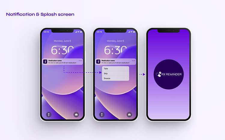
.png)
My role
-
User research & Analysis
-
Persona creation
-
Wireframes
-
UI Design & Prototyping
-
Usability testing

Tools
-
Figma
-
Adobe XD
-
Padlet
-
GlooMaps

Timeline
December 2022 - January 2023
Design Process

Summary
In this 3 week long project for the Rx Reminder mobile app, I took a user-centered design approach. I primarily used qualitative research methods consisting of literature review, user interviews, competitive analysis, and persona construction. I started by asking myself a few initial questions.
What is the product and who is it for?
What do the primary users need most?
Who are the biggest competitors?
What challenges may be faced moving forward?
Challenges
-
Create a product with a neat and straightforward design
-
Design a logical interface for familiar and unfamiliar users
-
Provide a simple way to track and remember to take medications
Research
My research began with a series of interviews to learn more about the behaviors, needs, and motivations of the users. The goal was to understand routines users have in place for remembering to take their medications and/or any frustrations they may have with their existing routines. Through these interviews, I learned more about the users and the issues they face.
The key findings of these interviews were:
-
Users need an organized system for tracking their medication
-
Users want to keep track of family members' medications
-
Users prefer devices to be simple and easy to use
-
Users want reliable notifications that will hold them accountable to taking their medication
User Personas
These personas were created based on the information and findings gathered from user interviews. All designs and iterations were based around these personas to keep the needs and goals of users at the forefront of my mind.

Sarah is a busy students who needs an efficient way to remember her medications so she can stay on top of her studies and social life.

Sam is newly retired and needs an easy way to remember to take multiple medications so he can improve his health while not burderning his family.
User Journey Map

Mapping Sarah's user journey revealed how helpful it would be for our users to have a dedicated space for medication reminders. Most of our users have been relying on calendar reminders, which often lead them to overlooking the reminders they have in place because they get lost in the mix of other daily reminders. Users also lack the ability to easily track when the medication was taken. Rx Reminder was created to give users an app solely for tracking and remembering their medications.
Competitive Audit
The competitors don't sufficiently address the user need to keep track of family members' medications. Rx Reminder could differentiate by helping users track the medications of family members and help them see whether their relative has taken their medication at the chosen time. The competitors also lack back up notification system in case the first one fails. Rx Reminder could differentiate by putting in place multiple notification systems in case the first one doesn't do the trick.
Gaps our Competitors Have:
-
Competitor’s don’t offer a free app
-
Competitor's don't sufficiently address the need to track family members medications
-
Competitor sites lack a back up notification system
Opportunity Areas:
-
Offer a free mobile app that allows users to create accounts for themselves and family members
-
Offer back up notifications such as calls and texts
-
Create a clear brand identity to attract users
-
Optimize design for screen reader usage
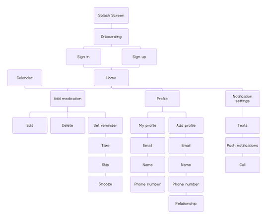
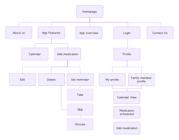
User Flow
I designed a flow to start visualizing how users will interact with the product and ensure I've included the necessary information users need to successfully use the app.
.png)
Sketching and Wireframes
I had a list of screens to cover all scenarios so I started sketching designs to detail out the user flows. I drafted a few iterations of each screen to ensure the wireframes addressed each pain point to meet the users needs.

Low-Fidelity Prototype
After creating some p&p wireframes and planning out the main flow, I reviewed areas that needed improvement and those that needed to be changed altogether. A lot of time was spent on this step to ensure that the overall UX was where it needed to be before moving on to visuals.
Take a look at the lo-fi prototype here!

Iterations
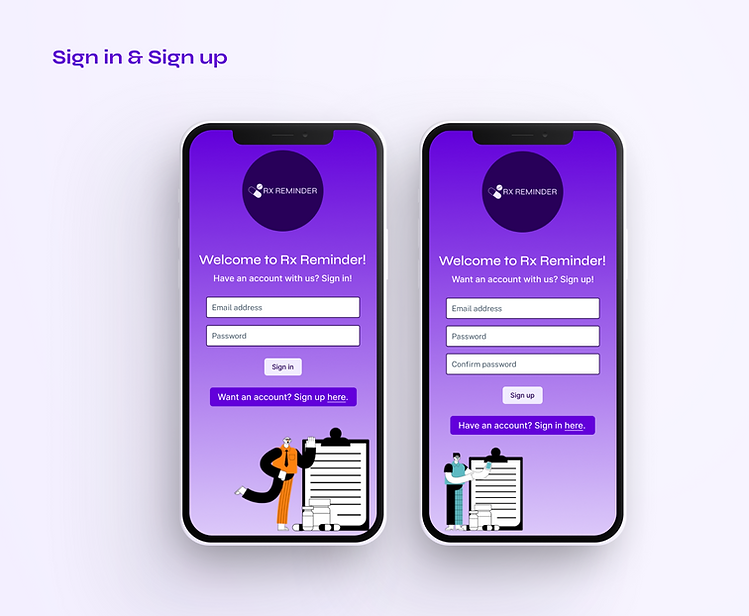
After creating a prototype from the low-fidelity wireframes, I conducted a moderated usability study with 5 participants. I asked them 4 questions that had them running through different scenarios in my prototype. They signed in, added a profile, added a medication, and marked off that they took their medication. I collected feedback from the participants to use for the next round of design iterations.
After creating a prototype from the low-fidelity wireframes, I conducted a moderated usability study with 5 participants. I asked them 4 questions that had them running through different scenarios in my prototype. They signed in, added a profile, added a medication, and marked off that they took their medication. I collected feedback from the participants to use for the next round of design iterations.
Findings
-
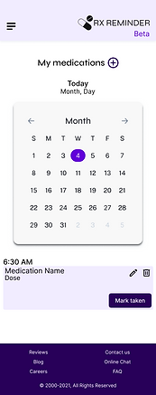
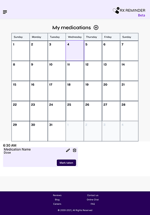
Calendar view - Users were frustrated that there was not an easily accessible calendar. They wanted the ability to plan ahead and see a few weeks down the road.
-
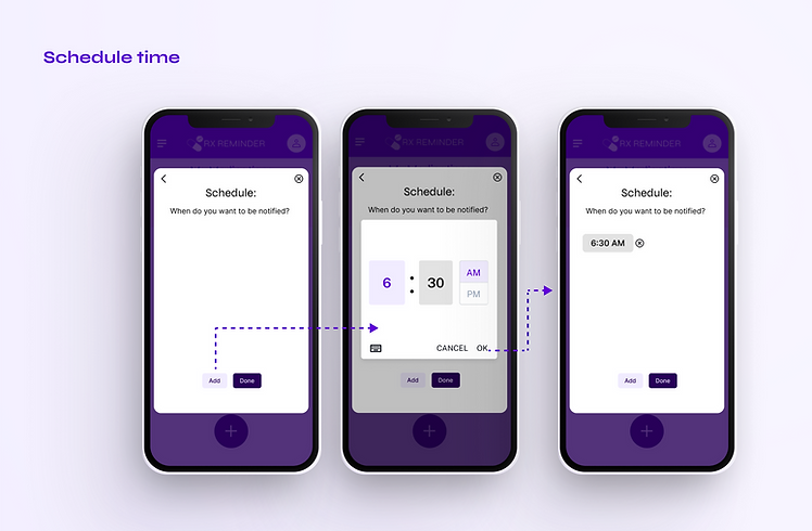
Too many clicks - Users felt like it took them too many clicks to complete an action. Specifically, they were frustrated by how long it took them to edit a medication reminder.
-
Button issues - Users were only able to click on the words in the button and not the button itself. This glaring issue was a top priority to ensure the app functions properly.
Style Guide
I chose to include bright colors to bring the app to life and make tracking medications fun.


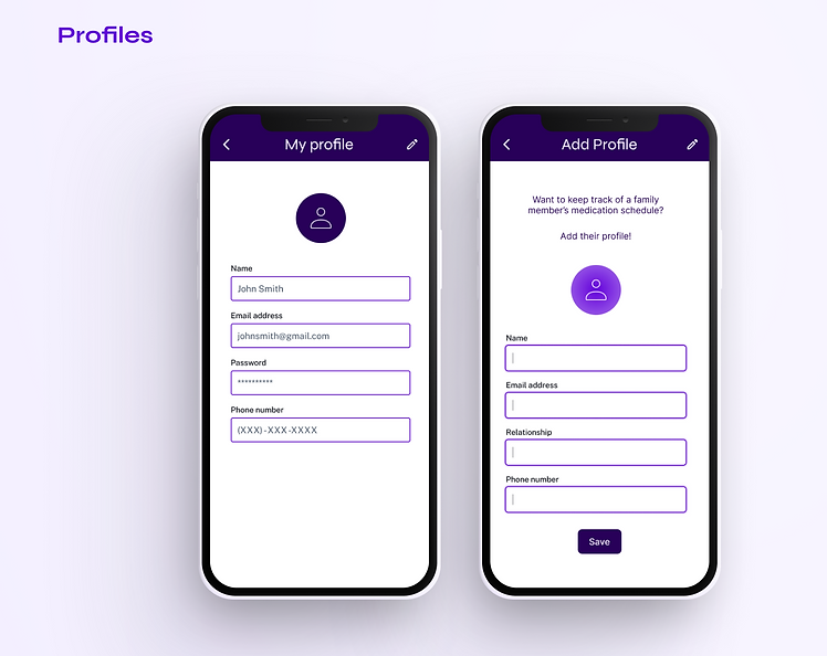
High-Fidelity Prototypes
Based on the findings from my first and second usability studies, I created high-fidelity prototypes to finalize the look and feel of the app. I gathered a group of 5 users to complete a moderated usability study to evaluate the first round of high-fidelity wireframes.
Findings from this study included:
-
Visibility concerns: A majority of users were overwhelmed by the amount of colors on the screen and were distracted from the main flow. They also thought some of the text was too small, which made using the app difficult.
-
Confusing icons: All users were confused by the pill icon when adding a medication. They didn't understand what the icon represented and therefore did not know that it was indicating for them to include a picture of their medication. When discussing the icon, users felt it was unnecessary to upload a picture of their medication since the pill often changes month to month in shape and color.
-
Unnecessary actions: Some users thought it was unnecessary for there to be a pop up option when adding a medication. They would rather all the information be on the homepage to reduce the amount of clicks it takes to complete an action.
Based on these findings, I iterated on my high-fidelity wireframes to produce a final high-fidelity prototype.


Main User Flow
Responsive Website Sitemap
With the app designs complete, I started to work on designing the responsive website. I adjusted my app's site map slightly to cater to the website and guide the organizational structure of each screen's design. I wanted to ensure a cohesive and consistent experience across various devices.
Responsive Designs
The designs for screen size variation included mobile, tablet, and desktop. I optimized the designs to fit the specific user needs of each device and screen size. Check out the mobile and desktop high-fidelity prototypes here!
Homepage
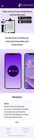
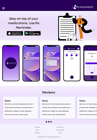
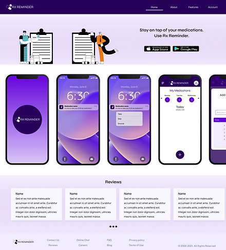
About


Features


Sign in


Dashboard

Takeways
Almost every adult takes medication at some point in their life. Too many times, people forget to take their medication on time and their health suffers as a result. Rx Reminder solves this problem by giving users a simple way to track and take their medications. The app was designed with users at the forefront of my mind. I focused on understanding their needs and goals to make a clean and straightforward end product. This project was centered around designing for social good. For this reason, I knew it was extremely important to connect with the community I was designing for to ensure their needs were met.